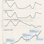
This chart is showing two stories moving on very different speeds.
The green line track annual mined gold production from 2001 to 2025. The yellow line tracks the gold price. And the big message is almost funny in its simplicity. Gold mining output did rise over time, but only modestly. It climbed from roughly the mid 2,000-tonne range in the early 2000s to the highest level in the series by 2025. That sounds impressive until you look at the price line. Price did not just rise. It tore higher.
That gap matters.
Because it tells you the gold market is not being driven by a flood of new supply. Mines are producing a bit more, yes, but not nearly enough to explain the scale of the price move. In other words, this is a market where demand, capital flows, central bank buying, inflation hedging, currency distrust, and geopolitical nerves are doing the heavy lifting.
And that is where the commodity impact gets interesting.
When gold rises much faster than production, it boosts margins for miners, improves project economics, and makes lower-grade deposits suddenly look a lot more attractive. It also sends a signal across the commodity complex. Investors start asking the obvious question. If gold can break higher while supply barely moves, where else could tight supply meet rising demand?
So this chart is really a reminder that in commodities, price often moves first, and supply reacts later. Very later. Mines do not turn on like a light switch. That delay is exactly where big bull markets are born.